Introduction
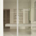
Located in Madrid, Spain, the Neutrale Store designed by Estudio DIIR presents a compelling reinterpretation of space through minimalist yet impactful design interventions. With a modest area of 100 m², the project stands as a testament to the power of simplicity in architectural expression.
Conceptual Gestures
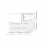
Estudio DIIR’s approach to the Neutrale Store revolves around three key gestures, each carefully curated to enhance the inherent qualities of the space. These gestures not only serve functional purposes but also contribute to the store’s overall aesthetic coherence.
Versatile Perimeter Device
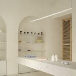
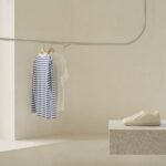
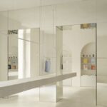
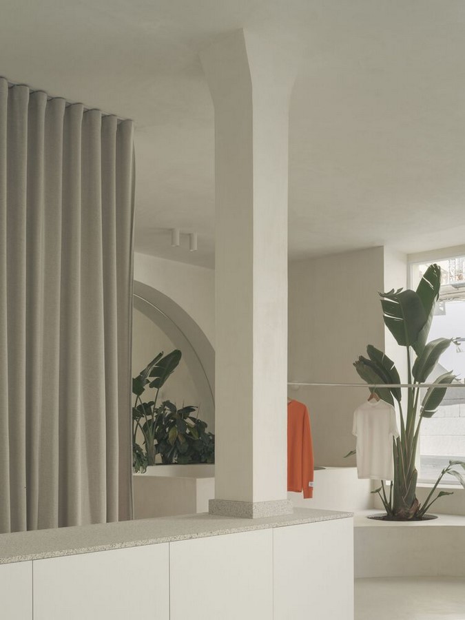
The first gesture involves the installation of a perimeter device along the store’s facade, capable of transforming its function based on usage requirements. This multifunctional piece serves as a mirror, shelf, bench, or planter, adapting seamlessly to the evolving needs of the space and adding a dynamic layer to the architectural composition.
Hinge Element: Longitudinal Piece of Furniture
Acting as a pivotal element, a longitudinal piece of furniture serves a dual purpose within the store. It functions both as a counter and as a spatial filter, delineating the boundary between the public and service areas. This intentional separation ensures efficient workflow while maintaining a clear distinction between customer-facing and operational zones.
Central Sculptural Volume
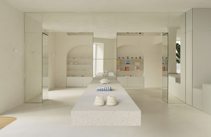
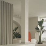
At the heart of the public space lies the most distinctive feature of the Neutrale Store: a sculptural volume designed to organize the sales area and establish a sense of hierarchy. This centrally located element not only serves a functional role but also contributes to the store’s visual identity, inviting customers to explore the curated product offerings.
Radial Path and Cantilevered Table
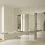
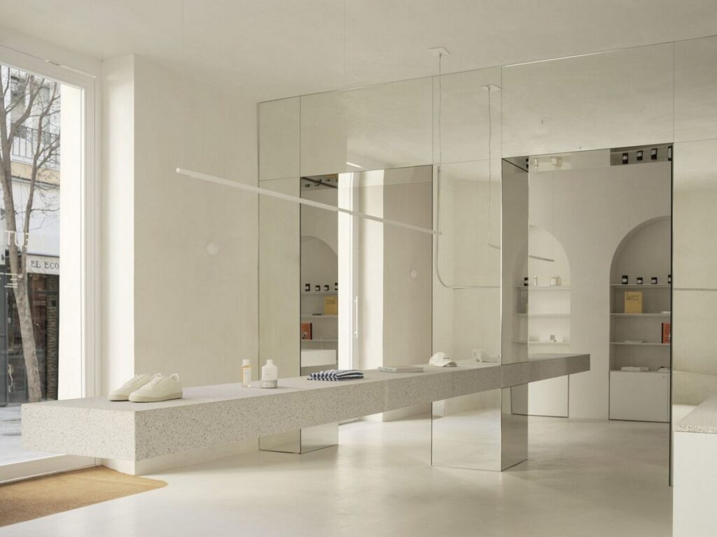
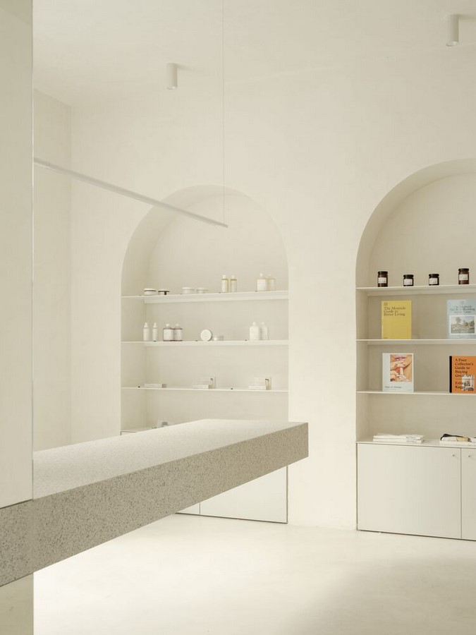
Complementing the sculptural volume is a large cantilevered table positioned perpendicular to the central piece. With an impressive length of 8 meters, this table guides customers on a radial path, encouraging them to engage with the displayed merchandise in a structured yet immersive manner.
Harmonizing Volumetric Power and Neutrality
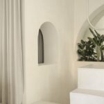
Despite the volumetric presence of the architectural elements, Estudio DIIR maintains a sense of tranquility and neutrality through the careful selection of tones and materials. This deliberate choice creates an atmosphere where the focus remains squarely on the showcased products, allowing them to take center stage within the spatial narrative of the store.
Conclusion
The Neutrale Store exemplifies Estudio DIIR’s mastery in transforming ordinary spaces into captivating environments through thoughtful design interventions. By blending functionality with aesthetic finesse, the project sets a new standard for retail architecture, where simplicity and versatility converge to create memorable spatial experiences.


